Tax Pro Plus
2999 Overland Ave.
Suite 204
Los Angeles, CA 90064
Map It!
Ph: (310) 827-4829
Fax: (310) 842-7160
info@taxproplus-la.com
QuickBooks 2013 Gives You A Reason To Upgrade
Tired of QuickBooks' cramped, claustrophobic screens and uneven interface? You'll be pleased to see the 2013 version.
You chose QuickBooks for a variety of reasons, a major one being its simplicity and usability.
But the software is more than 20 years old now, and hundreds of features have been added over the years. QuickBooks looks old, tired and in need of a makeover.
Not anymore. Intuit has totally redesigned the program's interface and navigational tools, providing a more consistent, streamlined, state-of-the-art look and feel. For the first time in a few years, there's a compelling reason to consider moving up.

Figure 1: The QuickBooks 2013 home page.
Clean, Efficient, Customizable
What Intuit heard from customers was that they wanted a clean, simple experience. They wanted QuickBooks optimized for efficiency, and they wanted to be able to customize quickly.
So Intuit built a brand new interface, one that offers:
- An across-the-board, consistent look and feel
- A minimal learning curve, aided by familiar software conventions
- A clearer, more obvious workflow.
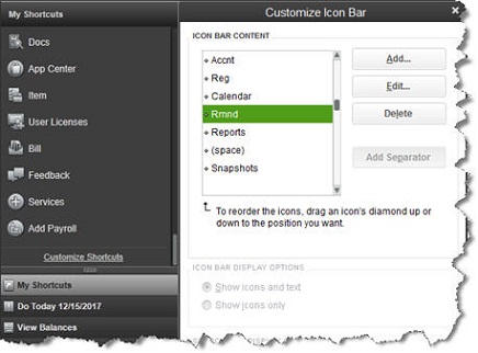
You can still use the software's standard drop-down menus. But you now have a choice between the old horizontal Icon Toolbar and a new vertical navigational panel (or neither of the latter two). You can customize the new panel to give you quick access to the functions and reports you use most often, saving time and unnecessary clicking.

Figure 2: The new vertical navigational panel can be customized to display the icons you want.
Familiarity, and Clear Signals
Whether you just handle a subset of your company's financial data or you're the only one working with QuickBooks, your workflow will be faster and more intuitive.
QuickBooks 2013 uses colors and other visual cues to provide helpful hints and speed up your work. If the same option occurs within more than one screen, it's always the identical color. When you're completing an invoice, for example, the Save & New button is a bright blue color, as it is on many other screens. The Save & Close and OK icons are the same shade within the forms and records where they occur.
Color is also used to signify related actions in the new navigational Ribbon, a familiar interface convention that replaces the mismatched icons that used to be displayed at the top of transaction forms. In QuickBooks 2013, the icons for related tasks are the same color, and the graphics themselves are much cleaner and well-positioned.

Figure 3: QuickBooks 2013's new navigational Ribbon is designed to accelerate workflow.
A Pleasure to Use
No area of QuickBooks remained untouched in this massive overhaul. Every screen has been modified to enhance readability and speed. Fonts look larger and clearer, and the overall design is more aesthetically pleasing.
So besides making your accounting chores zip along faster, the new look and navigation have a positive psychological effect: It's simply more enjoyable and less frustrating to interact with QuickBooks 2013. Its more modern, attractive look has a lot of appeal.
There are a few new things under the hood in this new version it's not just an interface update. For example, customer and vendor records are more flexible and thorough. You can attach to-do's to them, assign multiple contacts and store more contact options, like Facebook addresses and Twitter handles.

Figure 4: Contact records in QuickBooks 2013 are more readable and thorough.
Starting Fresh
There are other changes that will make your work life easier, like one-click access to both the Intuit App Center (where you'll find hundreds of integrated QuickBooks add-ons) and your most often-accessed reports.
The last few versions of QuickBooks have been rather ho-hum in terms of new usability and functionality. But we encourage you to seriously consider upgrading to QuickBooks 2013. We'd be happy to help you get up and running with it. Together, we can take a fresh look at your workflow to see if you and QuickBooks can build a better accounting experience.
|
|  |